Claude Brand Systems is Alexandra Studio's design-system service for B2B storytelling. It settles type, colour, grid, image treatment, claim wording and chart style once, so a team without a designer can produce more content, faster, and have all of it look like one company. The visual storytelling formats are comparative, USP and testimonial. Brands designed and companies worked with include Ace Health, Sleep Cycle, OKQ8, PSA Solutions and Nordic Fintech Summit.
Claude Brand Systems
Unique but Scalable
All websites are starting to look the same.
Same hero, same three columns, same soft gradient, same stock photography of people pointing at a laptop. When every company reaches for the same defaults, design stops being a way to tell companies apart — and a buyer comparing four vendors remembers none of them.
Scalable and Unique
Brand Guidelines for Consistency
Faster Production with Identity
A design system for storytelling, not a style guide.
We build the decisions once — type, colour, grid, image treatment, how a claim is phrased, what a chart looks like — so your team can produce more, faster, and have all of it look like it came from the same company. A system is what lets a founder post three times a week without a designer in the loop.
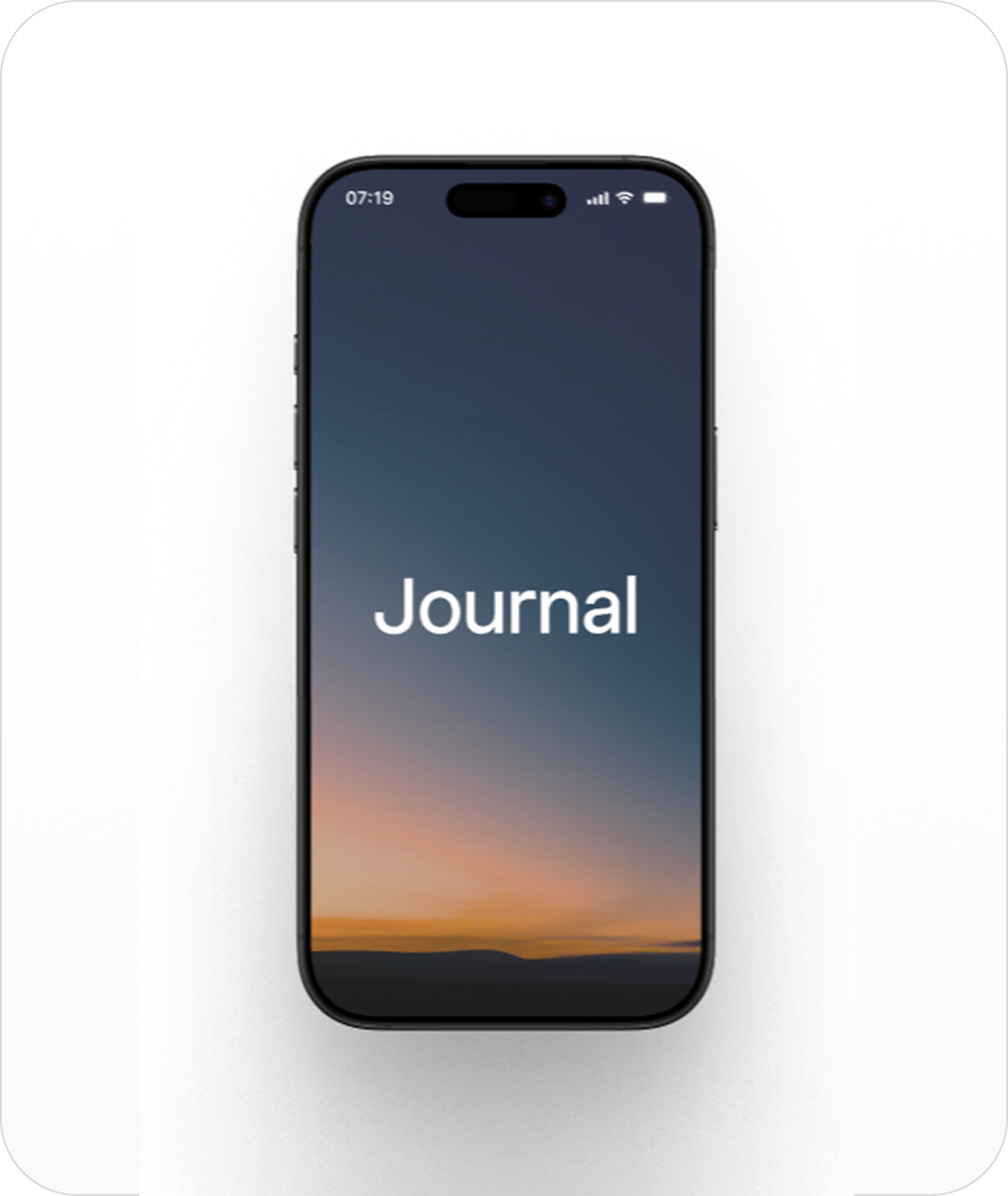
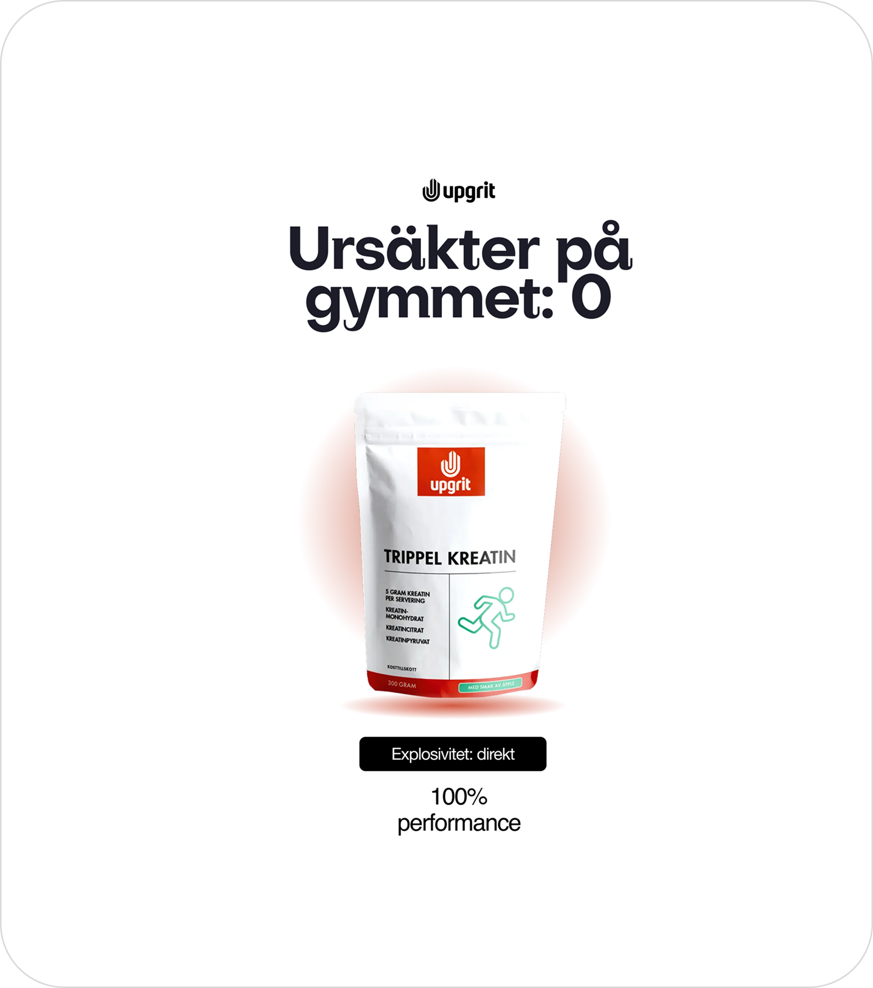
Visual Storytelling
Comparative
Put the old way next to the new one. Side-by-side formats are the fastest way for a committee to understand what actually changes if they buy — and the easiest thing for your champion to forward without explaining it.
USP
One claim, phrased identically everywhere it appears. Repetition is what makes a claim memorable, and a claim that shifts wording between the website, the deck and the post reads as three different companies hedging.
Testimonial
A named person at a named company saying the specific thing they got. Designed so the quote is the hero rather than a grey box under a headline — because in B2B, someone else vouching for you outperforms anything you write about yourself.
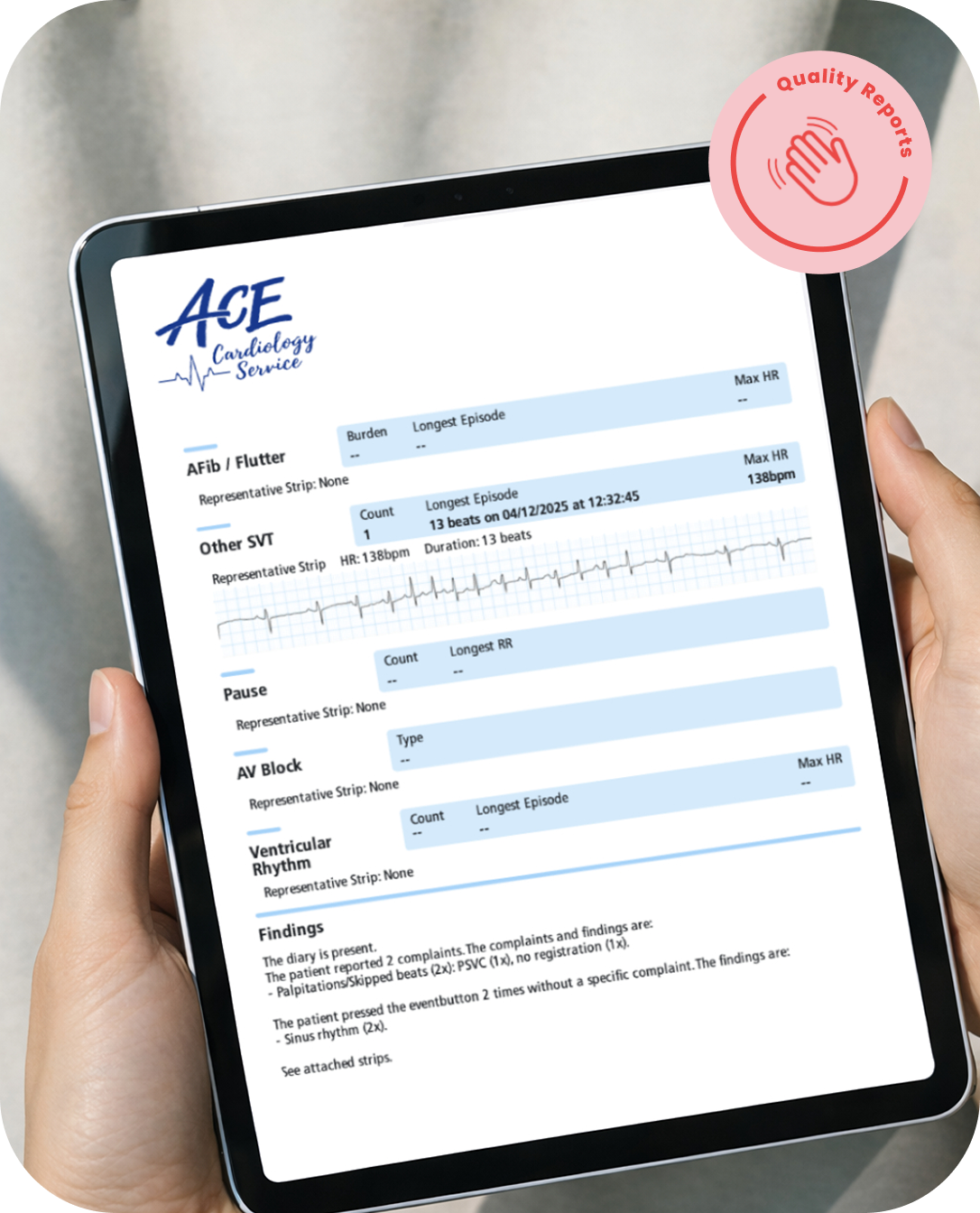
Brands we have designed and companies we have worked with
- Ace Health
- Sleep Cycle
- OKQ8
- PSA Solutions
- Nordic Fintech Summit
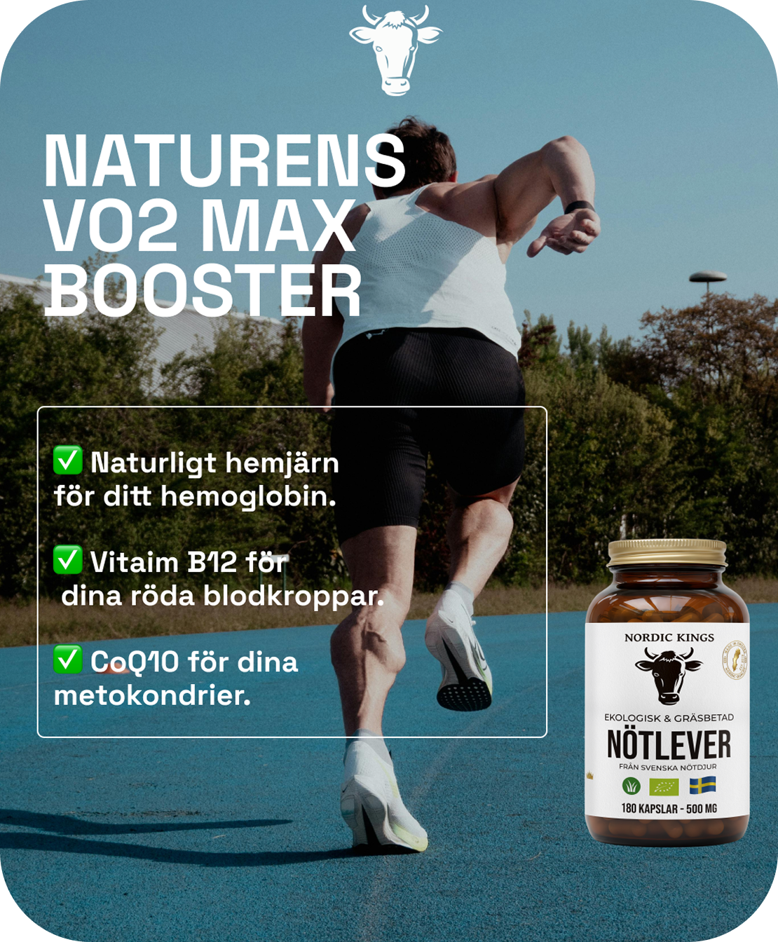
What branding is and isn't.
Branding is not a logo. A logo is a signature — useful for confirming who wrote something, useless for making anyone want to read it. Companies that treat the logo as the brand end up with a beautiful mark sitting on top of work that looks like everyone else's.
Branding is also not taste. It is not whether the founder likes blue. A brand decision is right when it makes the company easier to recognise and harder to confuse with a competitor, and that is a question with an answer rather than an opinion.
What branding actually is: the set of repeated decisions that make your output identifiable before anyone reads the name on it. Type, spacing, how photographs are treated, how numbers are presented, the rhythm of the writing.
In B2B, the practical test is volume. You will publish hundreds of things this year — posts, decks, event graphics, one-pagers, reports. If each one is designed from scratch, most of them will not get made, and the ones that do will not look related.
So the system has to be usable by people who are not designers. That means fewer options, not more: a fixed set of layouts, a decided way to crop an image, a template for a claim. Constraints are what make speed possible.
And it has to be specific enough to be worth having. A system built from defaults produces work indistinguishable from a competitor using the same defaults — which is the problem we started with, arrived at more efficiently.
FAQ
What is a brand system?
A small set of decisions made once — type, colour, grid, image treatment, how a claim is worded, what a chart looks like — so that every piece made afterwards is a variation rather than a fresh invention. It is not a logo and a colour palette in a PDF nobody opens. It is the thing that lets someone who is not a designer produce something on brand on a Tuesday afternoon.
Why does B2B need one more than B2C?
Because B2B publishes constantly and rarely has a design team. Six to ten people at the buyer each need to encounter you several times before they agree, which means volume — posts, decks, one-pagers, event graphics, reports. Without a system, that volume either stops, or it arrives looking like it came from five different companies.
Does a system make everything look the same?
The opposite of the risk people expect. What makes work look generic is reaching for a template because there is nothing else to reach for. A system that is specific to you — your type, your image treatment, your way of framing a claim — is what makes the output recognisable at a glance and impossible to confuse with a competitor.
How much faster is production, really?
The gain is not in drawing faster. It is in deciding faster. Most of the time between a good idea and a published post goes on decisions that were already made once and are being remade from scratch. When those are settled, a post takes minutes and a report takes an afternoon.
Who have you designed for?
Ace Health, Sleep Cycle, OKQ8, PSA Solutions and Nordic Fintech Summit, alongside the fintech clients of the growth practice. The work spans identity, campaign systems, social formats and long-form reports.